The most aesthetically pleasing Apple products
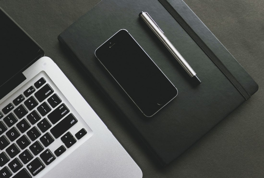
 Few companies enjoy the cult-like status that Apple has. With each new release, a wave of fanatics descends upon the Apple stores to get a glimpse of the holy products. One look at an Apple product, like the sleek new MacBook air, and it’s clear to see Apple sure knows how to design a product. From the early and quirky to the latest all-aluminum beauties, here are the best looking Apple products to date.
Table of Contents
iMac G3
1998
This was Apple’s first design under the late and great Steve Jobs. Masterfully sliding into the 1990’s pop culture landscape, these computers were different from any other that came before it, Apple or not. The base g3 was similar to Apple’s previous releases, but it was the colored computers that created a real buzz.
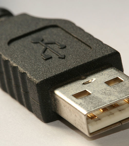
Available in 13 colors (Apple called them flavors, how cute) The all in one g3 looked like an astronaut’s helmet or something from the future. With lush color names like Bondi Blue or Cherry Red, the G3 looked less like a computer and more like a friendly companion ready to help you work and play. It was also one of the first computers to migrate to the then very new USB standard.
iMac g4
2002
Apple continued to push the envelope with the next generation of iMacs. These funky machines featured a soft, round body and a screen on an adjustable stalk. These machines won me over when I was a kid; I only now see the uncanny resemblance to the Pixar lamp.
These iMacs show off a side to Apple that may never see again; products that were designed to be cute and friendly. Modern Apple products are all business, with sleek lines and monolithic slabs of brushed metal. The G3 and G4 are reminders of a simpler time.
iPod Mini
2004
It’s almost comical how many times Apple changed the game and shook up entire industries. Experts derided the original iPod as useless… we all know who won that argument. Well into its 6th generation, the classic iPod was enjoying great success, in an attempt to capture a younger, poorer market share, Apple releases the mini, a smaller iPod in every way except charm.
Initially available in 5 metallic sheens, the iPod mini had a light, durable brushed aluminum frame, and a charming backlight screen. Beautiful to look at, use, and hold the iPod mini won so many hearts on its release that a strong community of users exists today, some 14 years later.
MacBook.
2006
My absolute favorite MacBook sadly almost forgotten under a deluge of unibody aluminum machines. Significant in many ways, the 2006 MacBook was the first Mac to migrate over to Intel CPU architecture. Before this change, Apple’s powerful G5 PowerPC CPU was doing the heavy lifting, but it was too power-hungry and ran too hot, a problem for Apple, who wanted to cash in on the expanding “pro laptop” market.
Enter the MacBook, a polycarbonate beauty with a powerful, efficient, and cool Intel CPU. Although released way back in 2006, the MacBook looks almost thin even today. Available in black or white, the obvious choice was black, nothing from any company had looked this sleek and sinister before. If you still have this model with you, you could easily get a great price should you opt for a Mac trade in.
Apple Remote (2nd generation)
2009
Released with the Apple TV unit, the Apple remote is a prime example of restrained design. So simple in its design its almost boring, but it wasnt. The proportions are perfect, the clean lines feel great in your hand, and the control layout is the ultimate exercise in effectiveness.
The second-generation remote continued Apple’s fascination with brushed aluminum, and it looks like it should have been with a MacBook pro.
iPhone 4
2010
There are those who think the iPhone 5 is the best phone ever produced, but they are wrong. The iPhone 4 was a revolution in phone design, not just for Apple but for the entire industry. Finally, the technology was there to build a powerful phone with a decent battery life that was THIN. The iPhone remains my most comfortable phone to hold and use.
Yes, the iPhone 5 was improved in screen size and performance, but to me, the proportions are off. Utilising the same design language, both phones look premium, but the smaller dimensions and overall “neatness” of the 4 make it the more aesthetic design. My only wish was that the ‘space grey’ color from the 5 replaced the brighter, cheaper finish on the 4.
MacBook Pro
2011
This machine marked Apples move towards the now-familiar space grey aluminum aesthetic. Noted for its sturdy and luxurious design, the pro really did feel like a high end, luxury item, that was capable of keeping up with a demanding professional.
Many now standard Apple design features debuted on the 2010 MacBook Pro and were refined in the 2011 update. A body milled from a single sheet of aluminum, tactile backlit keys, and a “no glass” touchpad where revolutionary.
MacBook air
2010 (2nd generation)
Razor-thin, beautifully finished and so lightweight it was almost like holding air (see what I did there?) The MacBook Air spread like a virus through libraries, classrooms, and airport lounges. No other laptop captured the imagination of traveling writes, artists, and professionals.
Several years later and the design still looks like it just rolled off the assembly line. An all aluminum body that tapers into a wedge distinguishes the Air from is portlier Pro cousins, and a silver bezel caused a stir from those who prefer a black bezel, but many others loved the departure from boring black.
It’s startling to see how many revolutions were inspired by Apple and its designs. Throughout their colorful history, the company has hit home run after home run, with gorgeous designs that inspired rabid fandom from scores of people all around the world. It is interesting to see how their designs so masterfully adapted to the times, from colorful and cheerful machines in the 90s to elegant luxury machines today. There is no question; Apple knows how to create an aesthetically pleasing product.


